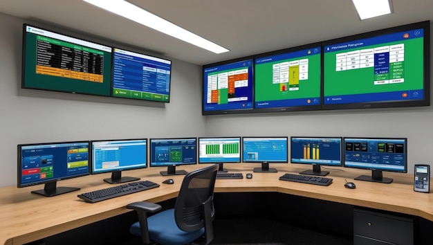
Transform Complex Data Into Visual Stories That Drive Decisions
Develop the ability to create dashboards and visualisations that make insights immediately clear. Build presentations that influence strategic direction.
Return to Home
Develop the ability to create dashboards and visualisations that make insights immediately clear. Build presentations that influence strategic direction.
Return to HomeThis programme develops your ability to transform raw data into visual narratives that communicate complex insights clearly. You'll master the tools that business intelligence professionals use to create dashboards, reports, and presentations that influence organisational decisions.
Imagine walking into meetings with visualisations that immediately clarify key trends. Picture yourself building dashboards that executives rely on for strategic planning. Envision creating reports that make your analytical insights accessible to non-technical colleagues. This course builds toward that capability.
Learn to present data in ways that make insights immediately apparent. Develop design sensibility that makes your work stand out.
Become proficient with Excel, Power BI, and Tableau. Build the technical foundation employers seek in business intelligence roles.
Create professional dashboards and reports that demonstrate your visualisation capabilities to potential employers.
You recognise that presenting data effectively matters as much as analysing it correctly. Yet creating visualisations that communicate clearly feels challenging. Your charts convey information but don't tell compelling stories. Your reports contain data but fail to guide readers toward key insights.
Perhaps you're comfortable with basic Excel but uncertain how to create dynamic dashboards. Or you've tried Power BI or Tableau but struggle to move beyond tutorial examples. The gap between functional visualisations and professional business intelligence work seems significant.
You see colleagues presenting dashboards that executives praise, and wonder how they developed such design sensibility. Understanding which chart types work for different data, how to use colour effectively, and how to structure dashboards for clarity all feel more art than science.
Visual communication skills develop through structured practice with design principles and business context.
This course provides that framework, teaching you to create visualisations that clarify rather than confuse, and dashboards that inform decisions rather than simply display data.
This course builds visualisation proficiency through the intersection of design principles, business context, and technical tool mastery. You'll work with datasets from retail, healthcare, and finance sectors, creating dashboards that address real business questions.
Master Excel capabilities beyond basic formulas. Learn pivot tables, data modeling, advanced functions, and dashboard creation within Excel.
Build interactive business intelligence solutions with Microsoft Power BI. Learn data modeling, DAX expressions, and report design.
Create compelling visual narratives with Tableau. Learn advanced chart types, interactivity design, and presentation techniques.
Understand visual design fundamentals that make dashboards effective. Learn colour theory, layout principles, and information hierarchy.
Throughout the course, you'll work with case studies from retail analytics, healthcare metrics, and financial reporting. This ensures your visualisations address real business questions rather than existing as technical exercises.
This course progresses from foundational visualisation principles to sophisticated dashboard development. Each week combines design theory with hands-on tool practice, building your capability gradually.
Begin with visual communication principles that apply across all tools. Learn which chart types work for different analyses and how to structure information for clarity.
Progress through Excel, Power BI, and Tableau modules. Each tool receives dedicated attention, with exercises demonstrating its particular strengths and appropriate use cases.
Work through scenarios from different business contexts. Create dashboards addressing specific analytical questions, learning to tailor visualisations to audience needs.
Create professional dashboards and reports that demonstrate your visualisation capabilities. These become portfolio pieces showcasing your ability to communicate data insights effectively.
Learn to present your visualisations effectively. Develop the narrative skills that make your dashboards persuasive and your insights actionable.
Feedback and iteration: You'll receive guidance on your dashboard designs, learning to refine visualisations based on user needs and business context. This iterative process mirrors real-world BI development.
Payment flexibility: We offer payment plans to make this investment accessible. Focus on developing your visualisation skills rather than worrying about upfront costs.
Visual communication skills have increasing value as organisations recognise the importance of data-driven decision making. The ability to present complex information clearly distinguishes professionals across industries.
Visualisation proficiency builds through practice with design principles and business context. Here's how we track your development and ensure you're creating professional-quality work.
Each module includes practical exercises where you create visualisations addressing specific business questions. These aren't technical tests but applied design challenges.
Feedback focuses on both technical execution and design effectiveness, helping you develop professional visualisation standards.
Your dashboard projects develop through multiple review stages. We provide guidance on design choices, interactivity, and business alignment.
This iterative process ensures your final work demonstrates professional-level BI capabilities that employers recognise.
Monitor your developing expertise across Excel, Power BI, and Tableau. Identify which tools you're most comfortable with and where additional practice would help.
This awareness helps you articulate your technical capabilities when discussing opportunities with potential employers.
Near course completion, we review your portfolio dashboards and help you present them effectively. This includes guidance on documentation and demonstration techniques.
Your portfolio becomes evidence of your visualisation capabilities for potential employers or consulting opportunities.
Most participants complete this course in two to three months, depending on their available practice time. Visualisation proficiency develops through regular design work rather than concentrated study periods.
Expect to spend several hours weekly creating dashboards and refining visualisations. This consistent practice builds the design sensibility and technical fluency that distinguishes professional BI work from amateur visualisations.
We understand that investing in visualisation training involves both financial commitment and trust. Here's how we approach that responsibility.
Before enrolling, we discuss what the course covers, required time commitment, and expected outcomes. You'll understand what you're committing to and what you'll develop.
When you face visualisation challenges, instructors provide feedback and suggestions. We're invested in helping you develop professional design sensibility.
Work through modules at a comfortable rate. Recorded lessons and flexible project timelines accommodate working professionals with varying schedules.
After completing the course, you maintain access to all resources. Revisit content when working on new visualisation challenges in your career.
Our commitment: We teach visualisation with the understanding that design skills develop through practice and feedback. This isn't about memorising tool features—it's about building genuine visual communication capability.
Starting this course is straightforward. Here's what happens if you decide visualisation proficiency aligns with your goals.
Reach out through the form below. We'll schedule a discussion about your current visualisation experience, learning objectives, and answer questions about the course. This ensures it fits your situation.
If you decide to proceed, we'll provide information about upcoming start dates, payment options, and what you'll need to prepare. You'll receive access credentials and tool setup guidance.
Start with design fundamentals and immediately begin creating visualisations. Each lesson includes practical exercises that build your design capability through application.
Progress through tool training and case studies while building dashboard projects. Receive feedback that helps you refine your visualisation approach and develop professional standards.
Questions about the course? We welcome them. This represents a meaningful investment in your professional capabilities, and you should feel confident about the path forward.
Let's discuss how this course fits your professional development goals. Share your information below and we'll connect to explore possibilities.
Start the ConversationNo obligation. Just a thoughtful conversation about developing your visualisation capabilities.
Comprehensive training covering all aspects of data analytics. Build foundation skills across statistical analysis, programming, database work, and visualisation.
Focus specifically on Python programming for data science. Develop deep technical proficiency with libraries, algorithms, and machine learning techniques.